Visualizing Geospatial E-Commerce Sales Data with kepler.gl
Visualizing Geospatial E-Commerce Sales Data with kepler.gl

Task Background
As a part of an internal research and discovery exercise, we wanted to assess the usability and features of visual data analysis tools to examine an online ticket sales dataset for an event being run by one of our clients. Our dataset includes the locations of customers purchasing tickets online for the event, and how far in advance tickets for the event were being purchased. In this situation, a data visualization tool such as kepler.gl [1,2] was a perfect fit for quickly generating a view of the data that can be easily understood by any observer.
Kepler.gl is an open source geospatial data analysis and visualization tool developed by Uber. Kepler.gl can be integrated directly into a React-based web application or Jupyter notebook. For this exercise we will be using the “demo application” at https://kepler.gl/demo [3].
Please note that although these visualizations have been inspired by a real-life event, the actual visualizations have been put together solely for purpose of demonstrating kepler.gl.
Geocoding Ecommerce Orders
Before we can perform any geospatial analysis on our order dataset, we first need to geocode the addresses attached to our orders by assigning a latitude and longitude to each order. For our dataset, a MySQL database of customer orders and associated details, we will do this based on the postal code from the customer’s billing address. Many providers offer geocoding APIs with varying price points and request limits, but for this exercise we will use Google’s Geocoding API. For best results (and general readability of the dataset), we’ve “normalized” the postal codes by converting letters to uppercase and filtering out any spaces, hyphens, or other non-alphanumeric characters.
After our initial dataset has been exported to a CSV file, the next step is to retrieve the geocoded data. This was accomplished using a Python script, but this can of course be done with any language that allows you to make HTTP requests and/or write to a CSV. First, we import the necessary libraries, and load the geocoded data into a Pandas DataFrame object:
Pandas [4] is a very powerful open source library for Python with many features for data manipulation and analysis. It can quickly and efficiently read and write data in Series or in DataFrame objects, working with CSV, Excel, or text files, as well as database exports. Next, we’ll begin the process of building a postal code “directory”, mapping a postal code to its latitude and longitude values. An example of an entry might be: [N6J3T9, 43.3326543, -79.4324534]. We’ll use this to decorate our current dataset, but also keep it on-hand for future use so that we can apply it to any repeated postal codes in future without having to make redundant API calls. To make these requests to Google’s Geocoding API, we use the open source Requests [5] library for Python, which offers simple functions for making HTTP requests, to create a Session object for making our multiple requests. We also use the Geocoder library [6], which comes with simple functions to make geocode API requests to many different providers, including Google, Bing, ArcGIS, and more.
This code will iterate through each of the unique postal codes in our dataset and make a request to obtain its approximate latitude and longitude. We’ll both save the response to our directory file and output it to the console so that we can still copy it to a file in case something goes awry while the script is running. If the script does get interrupted for any reason and we end up with only a partial set of geocoded data, we can simply repeat the process with any already geocoded values filtered out and merge the resulting files together.
Once we have our geocode data, we can use Pandas to decorate our initial customer data export with it.
With the data prepared, we’re now ready to import it into kepler.gl.
Visualizing Data in kepler.gl
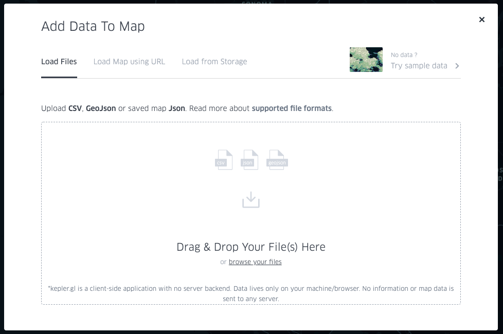
Loading data into kepler.gl is simple, with the demo application at https://kepler.gl/demo providing an intuitive way to start viewing your data on a map immediately. When the page first loads, you’ll be prompted to upload your data. Note that the kepler.gl demo runs in your browser, so any uploaded data are not sent to their servers but remain on your local machine.
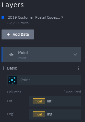
Based on the columns in the dataset, kepler.gl will attempt to automatically decide how to render the data. If your dataset has columns labelled ‘lat’ and ‘lng’, kepler.gl will automatically recognize them and use those fields to place your data on the map.
The columns to use for latitude and longitude can also be manually specified when defining your data layer. Click the carat next to the name of the layer to view settings, then click the ellipsis next to “Basic” to select which columns to use for your point locations.
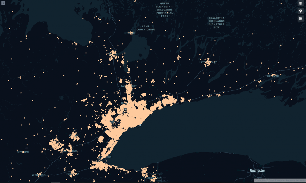
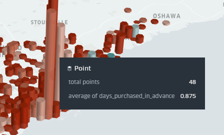
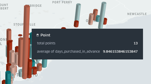
The map in its current state is showing us the location of each individual ticket purchased, but kepler.gl offers different layer types that we can use to aggregate the data. For this exercise, we’ll use a Hexbin layer, which aggregates datapoints into a hexagon of a specified radius (1km by default).
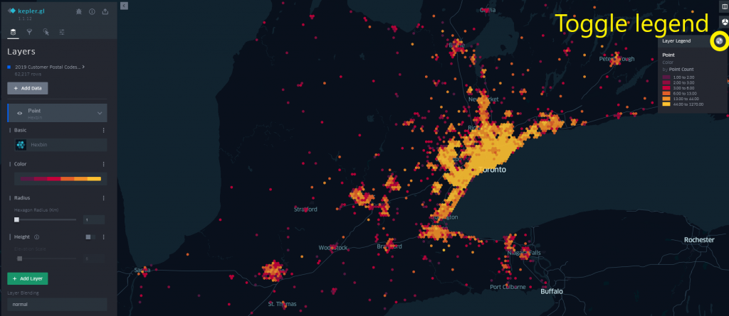
A colour on a selected spectrum is assigned to each Hexbin based on a specified metric. This is based on the point count by default but can be changed to any column in your dataset. The colour scale used and the number of steps in the spectrum can also be configured.
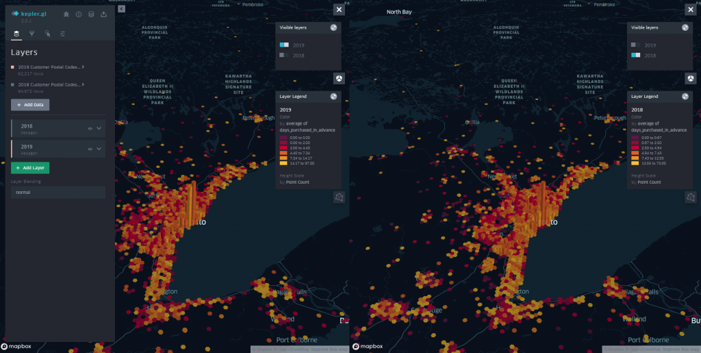
If we switch from a 2D map to a 3D map by toggling the cube icon in the top-right, we can assign a height value to our hexbins based on another field from our dataset. For this example, we’ll have the height represent the number of points per cluster (which, in our case, represent the number of tickets purchased), and have the colour represent how many days in advance of the event date the tickets were purchased. An elevation scale can also be applied, to more easily identify extreme values in the dataset.
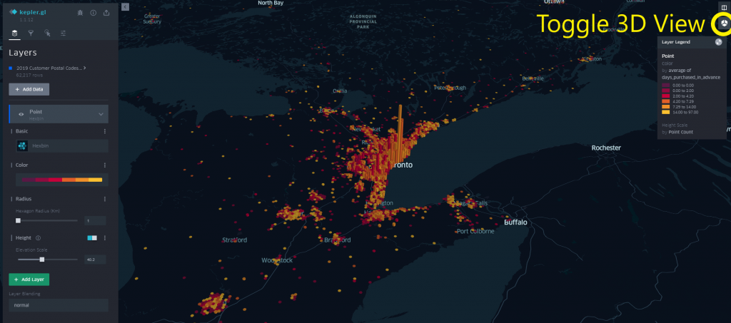
Visually we see represented that although there are customers who will purchase in advance across the province, those further away from the centre of Toronto appear to be more likely to purchase closer to the event date (where darker datapoints indicate that the ticket was purchased on the day of the event). This makes sense since variables such as weather will factor into the customer’s decision-making process.
Next, we can apply a filter to the dataset based on any of its columns. Click the funnel icon to switch to the Filters tab, then click Add Filter and select a column.
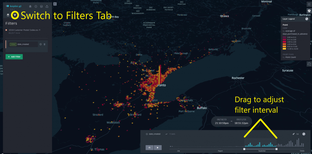
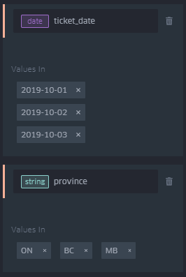
For numeric or “time” datatypes (eg formatted as a date and time like 2019-12-25 12:00:00), you can select the minimum, maximum, and range of values for the column to filter to by clicking and dragging on the displayed range. When filtering by time values, you can also click the play button to show a time lapse animation of the map data (you’ll need to click and drag the edges of the date filter interval at the bottom of the screen for this to be useful). For other datatypes such as strings or dates, specific values can be selected to filter by.
If we want to compare data across multiple datasets (eg between multiple years of event sales data), we can simply add another layer to our visualization in kepler.gl. At this point, it’s helpful to rename your layers from the Layers tab from the default “Point” label to more easily differentiate between them in the menus and legend.
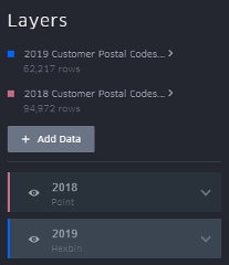
You can display multiple layers on the same map view if you wish, but if we’re trying to do a direct comparison between similar datasets as in this example, it makes more sense for us to view each dataset on its own map. We can do this by clicking the icon in the top right to switch to dual map view, and toggle which layers are visible in each view. Note that filters are applied separately to each layer.

Conclusions
As mentioned earlier, the initial geocode data retrieval and decoration of the dataset can be accomplished through any number of methods, but we chose to use the mentioned Python libraries in order to assess their utility for future projects. This exercise did not go in-depth into Pandas functionality, but we’d encourage you to look into it to see if it may suit your needs, as it offers a wide variety of features.
Kepler.gl allows for professional looking data visualizations to be generated very quickly and offers many different types of data visualization. In addition to the points and hexbins demonstrated here, kepler.gl’s available data layers include heatmaps and clusters for aggregate analysis, arcs and lines for visualizing movement, and GeoJSON layers for displaying complex paths or polygons like trip routes. If we need to perform these types of analyses in future, kepler.gl would be an obvious choice. The generated views have a definite “wow” factor when presented for the first time, and can provide clear, actionable insights depending on the data being investigated
Kepler.gl is also available as a React library that can be integrated into existing frontend projects. For future work, we may investigate implementing the ability to view subsets of recent sales data in a kepler.gl map embedded into a management interface.
One thing to watch out for: the scale of the colour and height/size of your datapoints will change dynamically based on the subset of data being currently examined. This means that when comparing data from one view to another, you’ll have to keep an eye on the legend to ensure that the conclusions you’re drawing are accurate. For example, two points from different filtered sets of your data may have the same colour, but the range of values for which a particular colour is assigned may vary between the views (eg. A point may appear red for a value less than 16.2 in one view, where in the other view the threshold is 12.0). Unfortunately, there does not currently appear to be a way to standardize this scale when performing timeseries playback or using the dual map view.
Thomas Trovato
Thomas Trovato is a Software Engineer at Dattivo Software in London Ontario.
Follow Me: